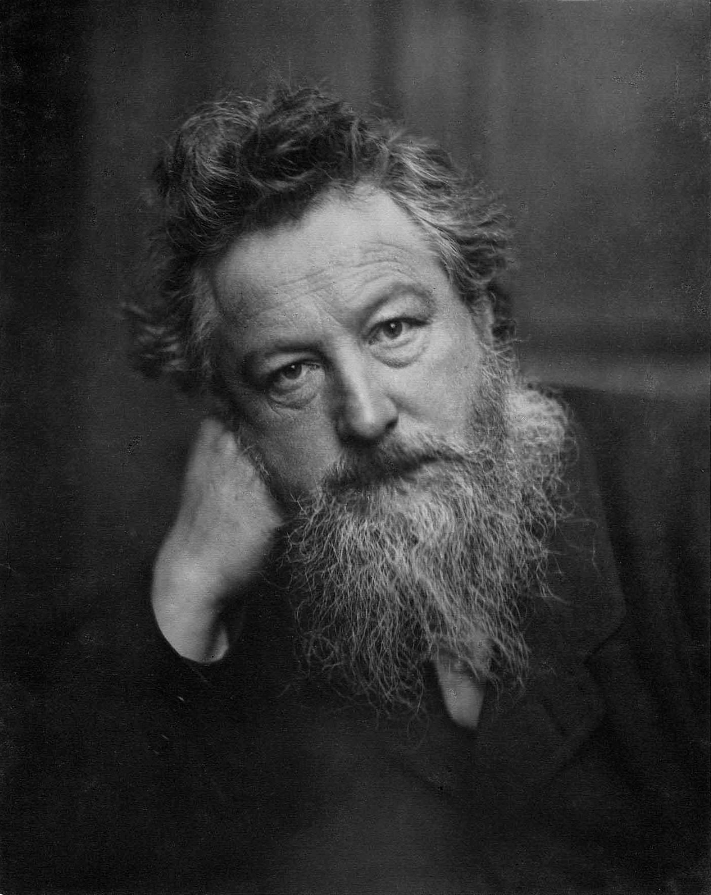
William Morris
Born March 24, 1834
Known for Wallpaper and textile design, fantasy fiction / medievalism, socialism
Notable work Textile and typographic design
“Have nothing in your house that you do not know to be useful or beautiful.”
William morris
That was the rallying call of the nineteenth-century designer William Morris, a British designer and social reformer. He aimed to rid the world of shoddy mass-produced goods and replace them with objects designed and made by artists.
He has long been considered the great Victorian and referred to as one of the most influential British designers of the nineteenth century.
While at Oxford, he became genuinely interested in the ritual architecture of the middle ages. However, his most significant influence came through the readings of John Ruskin, whose ideas on aestheticism and social progress he gradually adopted.
Embed from Getty ImagesMorris believed his responsibility was “to revive a sense of beauty in home life, to restore the dignity of art to household decoration.” His designs were much-loved by the aesthetic movement of the time, including Oscar Wilde and Rex Whistler. In 1861 he established his firm to design and produce wallpaper and textiles. Morris produced his first printed textile design in 1873 and today many of his designs are still used. His original designs are still re-coloured and reworked, and marketed under his name. Some of his carpet designs were used by other makers, but Morris also established looms in Hammersmith, London, where craftsmen hand-knotted carpets in the traditional Asian manner. Morris helped improve the overall design standards as the emerging styles began to mirror the general artistic trends of the period.
Art Noveau
William Morris became as familiar to the Art Noveau aficionados as those of Picasso and Matisse to the more general public.
There is a story told about Morris, that as a young man on a walking trip in France, he had a vision of a perfect house. So vivid was the image that the 26-year-old scribbled notes describing the property on the only thing he had at hand, the back of a French railway timetable.
The home he built in the hamlet of Upton, near Bexleyheath, South East London – known as the Red House — revolutionised British taste.


William Morris – Typography – Kelmscott Press
The Kelmscott Press was the forerunner to the modern printing press whose influence on present-day print typography is attributable. The typeface of the Victorian era was ugly, and the notions of ‘visual communication’ were not a significant consideration. The printers lumped an array of different typefaces on the same page that ended up as more of an obstacle than an aid to communication. There seemed to be an aversion to leaving any white space, and many rococo embellishments were kept to provide fillers of whitespace.
William Morris articulated his vision in a note on the founding of the Kelmscott Press.
“Letter pure in the form: severe, without needless excrescences; solid without the thickening and the thinning of the line which is the essential fault of the ordinary modern type and which makes it difficult to read; and not compressed laterally as all later type has grown to be owing to commercial exigencies.”

William Morris designed his own typeface based on the fifteenth-century face of Nicholas Jenson. He studied Jenson’s type in great detail, he had it photographed and enlarged and made drawings of it over and over again. The resulting type he called “Golden.” Apart from this face, he worked on three others: “Troy” and “Chaucer”.
To the contemporary eyes, Morris’s books would perhaps, seem rather than the distilled essence of beauty. The pages of his books appear to be close-packed and the type is heavier than would be used today. He also had a weakness for large and ornate capitals (sometimes they were hand-painted, which gave a lopsidedness to the page.
Embed from Getty ImagesMore British Textile Designers

Ilse Crawford for Kasthall: A Harmonious Symphony of Texture and Nature
Ilse Crawford collaborates with Kasthall to create a rug collection inspired by the serene Swedish landscapes, celebrating nature’s beauty and…
Keep reading
Georgina von Etzdorf: A British Design Icon
Georgina von Etzdorf, a British designer, has made a lasting impact in textile, fashion, and product design with her timeless…
Keep reading
Eileen Hunter (1909 – 1979) British Textile Designer and Writer
British textile designer and writer, Eileen Hunter, revolutionized the industry with her vibrant colors and innovative patterns. Equally skilled in…
Keep reading
Robert Yorke Goodden (1909-2002) British Architect Designer
Robert Goodden, a prominent British architect and designer, greatly influenced modern British silver design. He also contributed to post-war design…
Keep reading
Evelyn Wyld (1882 – 1973) British Designer Textiles and Rugs
Evelyn Wyld (1882 – 1972) was a British designer who was born in 1882. She studied at the Royal College…
Keep reading
Elizabeth Peacock (1880 – 1969) British Textile Designer
She was best known for the eight banners commissioned by Leonard and Dorothy Elmhirst for the Great Hall in Dartington…
Keep reading
Enid Crystal Dorothy Marx (1902 – 1998) British Textile and Graphic Designer
Enid Marx (1902-1998) was a British textile and graphic designer known for her influential patterns. Her versatile work spanned textiles,…
Keep reading
Alastair J.F. Morton (1910 – 1963) British Textile Manufacturer
Morton joined his family’s Morton Sundour Fabrics in 1931 and oversaw the company’s first screen-printed fabrics. He was the artistic…
Keep reading
Jacqueline Groag (1903 – 1986) Czech Textile Designer
Jacqueline Groag (1903 – 1986) was a Czech textile designer and ceramicist. Born in Prague she studied in Vienna at…
Keep reading
Lucienne Day (1917 – 2010), Influential 🇬🇧 Textile Designer
Lucienne Day was one of the most influential post-war British textile designers. She developed a unique style of pattern making.…
Keep reading
Laura Ashley (1926 – 1988) British Fabric and Fashion Designer
Laura Ashley was one of the first British designers to experiment with the concept of lifestyle marketing. Her romantic vision…
Keep reading
Minnie Macleish (1876 – 1957 ) British Textile Designer
She collaborated with Charles Rennie Mackintosh and Constance Irving at London’s Foxton textiles and Amsterdam’s Metz store. Macleish was a…
Keep reading
Zandra Rhodes (b.1940), British fashion and textile designer
Zandra Rhodes studied lithography and printing at Medway College before going on to the Royal College of Art to study…
Keep reading
Peter McCulloch (b.1933) British Textile Designer
In the early 1960s, he taught at the Falmouth School of Art in Cornwall. Some of his textiles incorporated contrasting…
Keep reading
Allan Walton (1891 – 1948) British Painter, Decorator, Architect and Textile Designer
He commissioned some of the most innovative screen prints of the 1930s, designed by Vanessa Bell and Duncan Grant, as…
Keep reading
Owen Jones (1809-1874) British architect & Designer
Owen Jones was a 19th-century British architect and designer renowned for his Arabic-influenced ornamentation. Notably, he served as the Superintendent…
Keep reading
Margaret Simeon (1910 – 1999) British Textile Designer
She worked as a freelance designer of garment and furnishings textiles. Allan Walton Textiles, Edinburgh Weavers, Campbell Fabrics, and Fortnum…
Keep reading
Vintage Elegance: Pillowcase Inspired by William Morris
The KAQIU Vintage Tulips Pillowcase is a tribute to William Morris’s legacy, blending traditional craftsmanship with modern materials and techniques.…
Keep reading
Hand Weaving and Cloth Design by Marianne Straub
Marianne Straub’s book covers hand weaving, cloth design, yarn choices, loom preparation, weave types, and fabric variations. Includes glossary and…
Keep reading