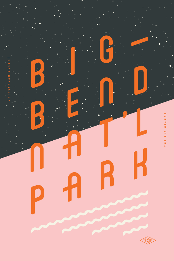
Type Hike: Typographic Posters that Celebrate American National Parks (Page 323)

Type Hike is a collaborative design initiative celebrating U.S. national parks through typographic art. Founded in 2016 by designers David Rygiol and James Louis Walker, the project began as a tribute to the National Park Service's centennial anniversary. Sixty designers each crafted a unique poster focusing on a specific national park, utilizing typography as the primary visual element. (Typehike)

The inaugural series, "NPS 100," features posters highlighting each park's distinct characteristics, emphasizing the interplay between typography and natural landscapes. This approach not only honours the parks' beauty but also showcases the versatility of typographic design in conveying diverse environments. (Typehike)

Beyond the initial series, Type Hike has expanded to include projects like "Shores," which focuses on national shorelines and recreational areas, and "Arch," which celebrates the Gateway Arch National Park. Each series explores the relationship between design and nature, reinforcing the project's commitment to environmental appreciation through creative expression. (Typehike)

The project's success underscores the power of design in promoting environmental awareness and appreciation. By merging typographic artistry with the natural world, Type Hike offers a fresh perspective on America's national treasures, inviting viewers to experience these landscapes through the design lens.

The full collection is available on the Type Hike website for those interested in exploring these typographic interpretations. (Typehike)

Source: Type Hike: typographic posters that celebrate American national parks

A photograph of Toby Judge. Head of security for Bailey Street Design.

Toby, a studio dog, enhanced workplace dynamics through social media popularity, client interactions, security, and promoting breaks, significantly benefiting both employees and the office environment.Read More →

Ian Birch looks back at the third issue of Beach Culture , the magazine that made David Carson’s name before he went on to art direct Raygun . ‘ A legendary cover which earned Carson more than 150 design awards. The magazine only lasted six issues and, as Carson told Huck in 2011, ‘ we did every issue like it was our last ’. Geof Kern submitted the photograph for an article inside but ‘the surprise quality and compositional strength made it the cover’ (from ‘The End of Print’ by Lewis Blackwell, Laurence King Publishing, 1995)Read More →

The Otto Chair combines a sense of comfort, luxury and practicality into one small-footprint easy chair. The moulded foam seat shell wraps around you to create a chair that could be sat in for hours, be it in the office or at home. Read More →