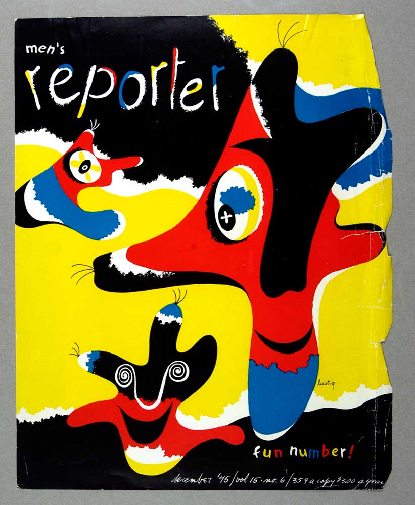
In the design world, text and typography convey messages effectively. The way text is presented has the power to enhance readability, evoke emotions, and capture attention. To achieve visually pleasing and harmonious designs, designers utilize various techniques, including leading, kerning, tracking, and justification. In this article, we will explore and unravel the mysteries behind these fundamental aspects of text and typography.
Understanding Leading: The Vertical Space Between Lines
Leading refers to the vertical space between lines of text, which affects readability and visual hierarchy. Proper leading creates breathing room for letters, preventing them from feeling cramped or overly crowded. The key is to strike a balance between legibility and impactful design. Increasing the leading can make text appear more open and relaxed while reducing it can create a denser and more compact look. Experimentation with leading is essential, especially when dealing with different fonts, sizes, and media.
Mastering Kerning: The Art of Space Adjustment
Kerning involves adjusting the spacing between individual characters within a word or a phrase. This technique helps ensure a consistent visual appearance by preventing awkward gaps or tightly squeezed letter combinations. When kerning, designers focus on achieving optimal spacing between adjacent characters to enhance readability and maintain visual harmony. Special attention is often given to letter pairs, such as “AV,” “TY,” or “WA,” where adjustments are necessary for a balanced and visually pleasing outcome.
Exploring Tracking: The Consistency of Character Spacing
Tracking, sometimes called letter spacing, is the adjustment of the overall spacing between characters throughout a text block. Unlike kerning, tracking affects the space uniformly across all letters. Designers use tracking to achieve various visual effects. Decreasing the tracking can create a denser and more compact appearance while increasing it can give a more spacious and open feel. Tracking can improve legibility, emphasize specific phrases, or enhance the design aesthetic.
Unveiling Justification: Achieving Balance and Alignment
Justification relates to the alignment of the text within a defined area, such as left-aligned, right-aligned, centre-aligned, or justified alignment. While alignments affect the visual presentation, the justified text is worth exploring. Justification distributes space evenly between words and letters within a line, resulting in a clean, polished appearance. However, it can also introduce uneven spacing, rivers or awkward gaps between words. Designers should exercise caution when using justification, as it may require manual adjustments to maintain a balanced and visually pleasing outcome.
Text and typography are essential elements of design that demand attention and careful consideration. Leading, kerning, tracking, and justification are invaluable tools for designers to enhance legibility, establish hierarchy, and create visually appealing compositions. Mastering these techniques empowers designers to effectively communicate messages and capture viewers’ imagination. By understanding the art of text and typography, designers can unlock a world of limitless possibilities where words come alive and speak volumes through exquisite design.
More on Typography
Related Articles
Discover more from Encyclopedia of Design
Subscribe to get the latest posts sent to your email.


